Xducate
OVERVIEW
The pandemic has taught the world the benefits of online learning and that the new world includes hybridization in work, business, entertainment, and school. Xducate aims to play a role in this major shift by offering self-learning programs and humanizing online interactions through one-on-one mentors and group mentoring sessions.
I was the product designer for this project for DesignLab and it was done over the span of 4 weeks.
THE PROBLEM
Giving students the potential to learn new skills online and allowing them to match with mentors based on their needs is what will set Xducate apart from other platforms. One-on-one mentor sessions are essential to learning as it gives students the chance to build self confidence, become exposed to new ways of thinking, and it allows them to receive feedback in a productive way.
Matching students to the best mentor that suits their needs and learning style required exploring the ways in which people are matched. While some platforms perform that matching on their end, it can sometimes be beneficial to allow students to make that choice as well.
GOALS
User: Learn new skills and match with the appropriate mentor for their needs
Business: New user sign ups
Product: Iteration based on user feedback
Information is crucial for students to make informed decisions. For Massive Online Open Courses platforms (MOOCs), pages and onboarding processes can become overcomplicated. During the design process, this proved to be a challenge for Xducate. There was a lot of information that needed to be packed into limited real estate. To ensure that students were getting all the information they needed, I used concise copy, only included information that users would find valuable, and generally kept every page simple.
RESEARCH
I conducted user surveys and interviews to determine how to make Xducate work the way students would want. Results of the survey showed that the majority of participants were looking for mentorship in an online course and they hope to gain needed skills for their selected industry, feedback and support, and overall industry guidance from their mentor.
A card sort survey was conducted to get a better understanding of how users would naturally organize course information. This ensured that each page only displayed valuable information and minimized information overwhelm.
Including important features for a learning platform with limited real estate proved to be one of the biggest challenges of creating Xducate. Along with user surveys and interviews, a competitive analysis of direct and indirect competitors helped identify some gaps in the market. Some UX patterns I found from other MOOCs included having transcripts and allowing students to take notes in the platform itself.
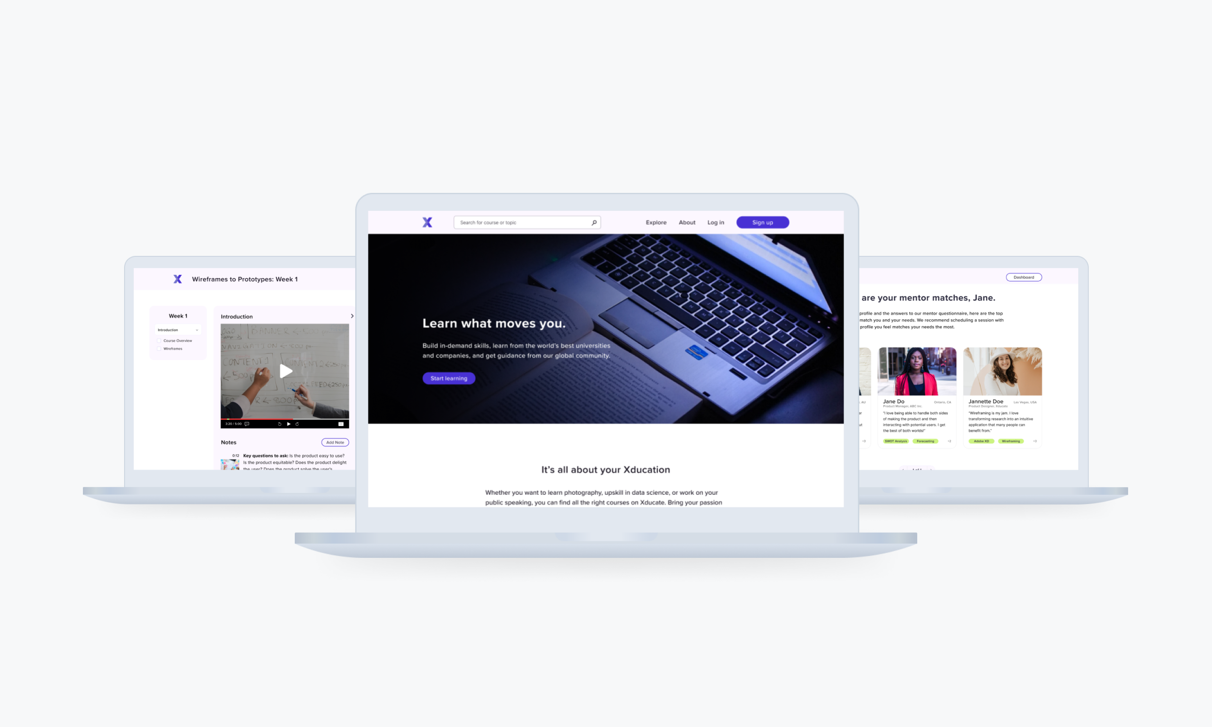
HOW IT WORKS
Home
Looking for information on MOOCs is a hassle. Their homepages are filled with different kinds of courses in different industries and it can probably cause information overwhelm. I made it easy for users to see if Xducate offers the right products and courses for them by keeping the home page simple and modern. They’ll be able to see from the start whether this is the right platform for them to further their education.
On-boarding made easy
Before users can use the platform, they have to answer a mentor-student matching questionnaire that can help Xducate determine which mentors may be a good fit for them.
While students will be presented with matches based on their needs and goals, they will have flexibility. This allows for the student and mentor to meet and determine whether they are a good fit because while they might be a good match on paper, it doesn’t guarantee a perfect fit.
Learning page
The most difficult part about designing the learning page was the amount of important features that needed to be included in it, but with limited real estate. I chose to add a transcript section as some students many need that visual for learning. A video plus a collapsible transcript tab allows students the luxury of both. Students are also able to add notes directly in the same page. While most students have a preference for note taking, this is a good option for students who have a hard time keeping track of notes they’ve made. When they add notes, it will highlight that portion of the script in the transcript and it adds a timestamp on the video.
RESULTS
More user testing needs to be conducted to see what kind of feedback Xducate would receive from users. While it looks more modern, fresh, and more user-friendly than other platforms, there’s room for improvement.
So What's Next?
LEARNINGS
This project, compared to my previous capstones, required more research than I anticipated at the start. It was definitely a huge undertaking for the amount of time that was given, but I learned so much more about the research process. Questions you’ve asked at the beginning of your research process may lead to even more questions. By the end of your research phase, you can either be left directionless or just filled with even more questions. This makes me see why companies and/or UX design teams are designed to take on one task, one flow, and one user journey at a time. Taking on too much at one time can cause more problems than it can solve.
Check out other projects:

